
Design Master Class: How to Style Your Home Like a Pro
“Stuff”—we all have it. Some of us are just better at displaying ours than others. To level the playing field a bit we reached out to a bunch of decorating professionals for styling tips because you deserve to have a home that feels just right.
Today, we’re talking shelfies, vignettes and coffee table tableaus; they can be tricky to nail down, but since these little decor “moments” really can set the mood in your home, the effort is worth it. Remember, you’re probably doing a lot right and just missing the mark on a few small things, so to help, here’s pro advice on how to turn your stuff into enviable displays.
Odd numbers are your friends
Have you heard of the Rule of Threes? It’s worth knowing. “Most things look great in threes,” says Donna Mondi of Donna Mondi Interior Design. There’s something about the asymmetry of an odd number of items that attracts visual interest and keeps your eye moving around a vignette, and by extension, a room, if you can create enough compelling well-styled surfaces.
Christine Markatos Lowe of Christine Markatos Design also says a series of five can work. Just be sure you don’t let your vignettes get too busy. Your mantel is not the place for nineteen different objects. Just saying.
Placement is key
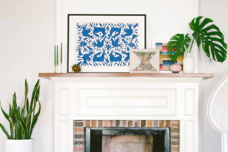
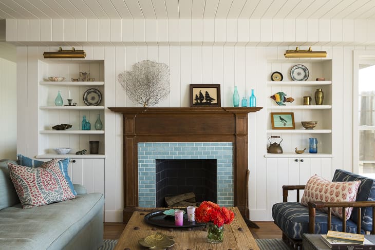
Not to get all design school on you, but in art and photography, there’s something called the principle of thirds, which basically says the most interesting, eye pleasing compositions happen when you place important elements at the intersection of the vertical and horizontal thirds of your canvas or frame. If you think of every tableau, shelfie or furniture tabletop in this way, this can help you create more dynamic displays. I mean, just look at the mantel above styled by Dabito of Old Brand New. Nothing is dead center. The smaller pieces of art appear to overlap at one of the thirds (of the mantel itself, no the image), and a shiny urchin object is sitting pretty at the other. Probably not a coincidence, people.
The takeaway here: instead of dead centering items on a surface, try moving your decorative set ups closer toward the four corners.
Variety is the spice of life—and of your vignettes
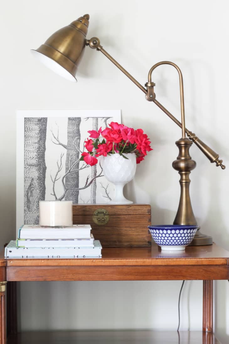
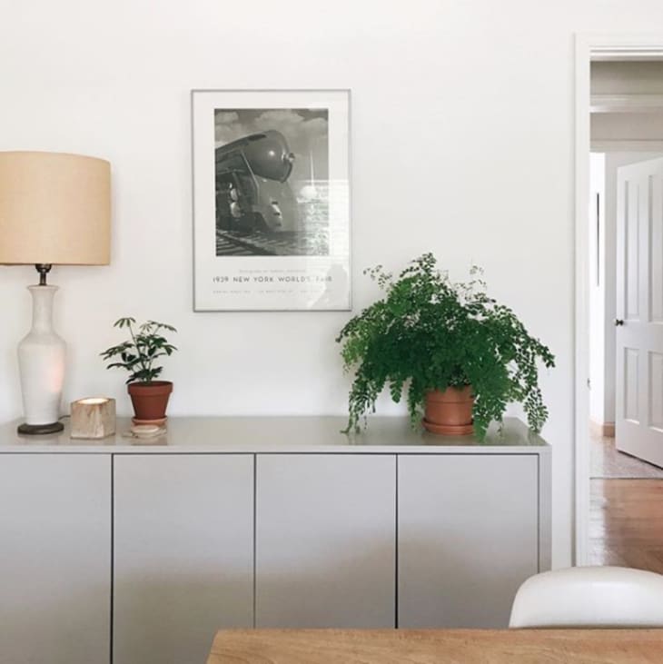
In order to achieve balance in your styling, you need to bring together items of different heights, scales, textures, colors, sheen levels and even materials. For example, says Donna Mondi, “If everything is getting too shiny, we’ll add in something organic like driftwood, marble or a petrified wood sculpture.” Essentially, you don’t want everything to be blingy, but you wouldn’t want all natural items either. The styling magic is in the mix. (Take a look at Erin Spain‘s combo of wood tones, antique brass, ceramic, and natural cut flowers; each material shines on its own, but also works in harmony with each other.)
If you can’t seem to get the heights of your objects right, Mondi suggests using coffee table books to physically elevate things. “If your books are not attractive, pull off their covers,” says Mondi. You could even go pages out, instead of spines, as seen on this little side table. Or look for a vintage leather book or two at a flea market to use for styling.
Theme it out!
“When grouping items, it’s important that they make sense together with a common theme,” says Markatos Lowe. “For example, at a beach house, you might combine a piece of coral with a glass bottle and an object made out of fishing rope.”
If you have a collection, go for it. But themes don’t always have to be so literal. You could group based on color or material as well, as long as you throw in one or two off-kilter items. Or use all items you brought back as souvenirs from a favorite trip. Get creative about the way you interpret the idea of a theme, and your display will be all the better for it.
Let objects breathe
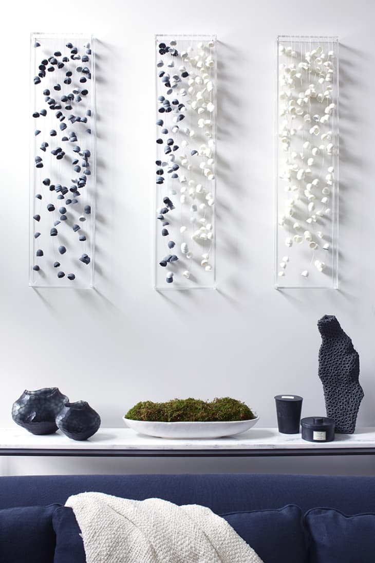
White space isn’t always a bad thing. If there’s too much, Lisa Adams of LA Closet Design will fill it with vases or plants in various heights. But there’s definitely something to be said for a little bit of breathing room around objects in vignettes or in between vignettes on a big piece. This keeps it from looking too cluttered and junky. (I applaud Jessica Comingore’s restraint in the vignette above which the design and branding specialist shared on her Instagram feed.)
Original art can be a game changer
“A lot of people don’t account for artwork, which can liven up a console or other piece of furniture,” says Birgit Klein of Birgit Klein Interiors. Prop a smaller piece up behind a cluster of objects on a shelf or tabletop. This will add instant dimension to your grouping along with a bit of personality and, potentially, color, if you’re into bold pieces.
Want a larger scale work (or works) to anchor your vignette? Hang it on a wall. But be sure not to cover it up entirely with your styling of objects below. Choose lower profile items for your mix. “A low bowl with moss or greenery centered on a console, with higher objects placed at either ends, allow the artwork to shine while creating a balanced vignette,” says Klein.
Even if you followed just half of this advice, you’d probably have a stylin’ surface. Add a plant for good measure, and it’s probably going to be Insta-worthy, so get on that and tag @apartmenttherapy because we’d love to see what you came up with!