1Pantone's Very Peri
 Courtesy of Microsoft, Pantone
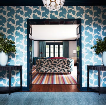
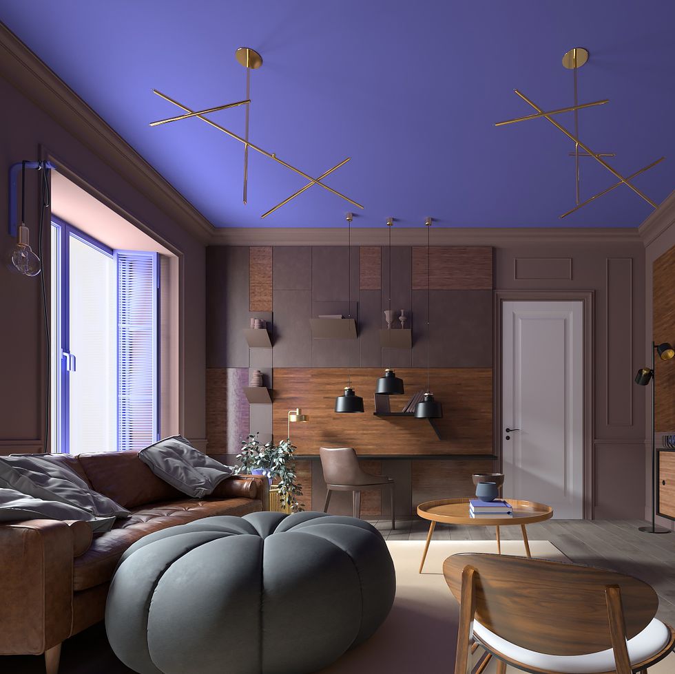
"As we move into a world of unprecedented change, the selection of PANTONE 17-3938 Very Peri brings a novel perspective and vision of the trusted and beloved blue color family. Encompassing the qualities of the blues, yet at the same time possessing a violet-red undertone, PANTONE 17-3938 Very Peri displays a spritely, joyous attitude and dynamic presence that encourages courageous creativity and imaginative expression." — Leatrice Eiseman, Executive Director, Pantone Color Institute
2Periwinkle Blue
 Courtesy of Pantone
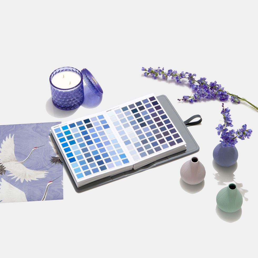
"Expect to see shades of periwinkle blue as a big focus for a paint refresh this spring. This color will complement existing color trends that have been popular this past year like rust color tones and shades of green." — Angela Belt, Angela Belt Interiors
Advertisement - Continue Reading Below
3Benjamin Moore's October Mist
 Courtesy of Benjamin Moore
Benjamin Moore picked a soft sage called October Mist as its 2022 Color of the Year. The versatile shade is part of the paint brand's 2022 Color Trends palette that includes primary hues, pale tones and botanical shades. “As the spaces in our homes continue to evolve, we uncover more opportunities to express our individuality and leverage the power of color to design environments that serve different functions and styles. October Mist 1495 and the corresponding Color Trends 2022 palette reflects an effortless harmony of colors, while inspiring unique combinations for any paint project.” — Andrea Magno, Director of Color Marketing & Development, Benjamin Moore
4Sherwin Williams' Evergreen Fog
 Courtesy of Sherwin-Williams
 Advertisement - Continue Reading Below
5Moody Hues
 tk
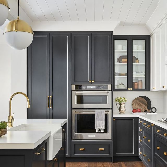
tk"You can't go wrong with making small spaces delicious with dark and smooth shades of black/moody hues. We especially love Jasper by Sherwin-Williams." — Hillary Stamm of HMS Interiors
6Benjamin Moore's Raccoon Fur
 Courtesy of Rebecca Hay Designs
"Benjamin Moore's Raccoon Fur has lovely blue undertones and takes the light differently throughout the day. It's dramatic without being too jarring. It can also help add character to cabinets and set the tone for a space." — Rebecca Hay of Rebecca Hay Designs
Advertisement - Continue Reading Below
7Vibrant and Earthy Hues
 Courtesy of Annie Sloan
"Paint trends will fall into two distinct camps this year: those who are seeking reassurance from nature and are choosing earthy, organic shades. Think olive greens, sandy neutrals and clay-toned terracotta shades. This kind of desert palette shade that always looks luxurious and comforting, whether on walls or textiles. On the other hand, lots of people are leaning towards the kind of vibrant, energizing and exciting hues, which were popular in the '50s." — Annie Sloan
8Warm Neutrals
 Courtesy of Sharp + Grey Interiors
 "Bright neutrals with a touch of warmth are on the verge. These shades add such great timeless depth and character. Paired with warm woods, rich rust velvet and dusty blush, these colors feel neutral and nuanced. The best option is Benjamin Moore's White Dove!" — Libby Rawes of Sharp + Grey Interiors
Advertisement - Continue Reading Below
9Pratt & Lambert's Feather Gray
 Courtesy of Jill Croka
"A very popular and favorite neutral paint color is any match of Pratt & Lambert's Feather Gray. This is such a sophisticated upgrade from a traditional neutral that can add a lot of depth to a room." — Jill Croka, Jill Croka Designs
10Farrow & Ball's Drop Cloth
 Farrow & Ball
 Advertisement - Continue Reading Below
11Terracotta
 Farrow & Ball
"While it seems people are still craving calm neutrals in their interiors, there is now a desire to spice things up. Faded Terracotta by Farrow & Ball is a warm, earthy tone that pairs beautifully with lighter creams, deep browns and sage green.” — Shannon Niehenke, Narrative Design Studio
12Muted Palettes
 Courtesy of Marina Hanisch Interiors
"This year is all about muted palettes in plaster and limewash finishes. Limewash is a paint technique that creates a warm and textural effect on your walls. It blends European sophistication with an organic natural effect." — Marina Hanisch, Marina Hanisch Interiors
Advertisement - Continue Reading Below
13Shades of Aqua
 Courtesy of Tanya Hembree
"Greens, aquas and peacock tones may seem like a flash from your grandmother's wardrobe, but those colors are sneaking into the top projects and designs for 2022 here at Onyx + Alabaster. One of our current remodel projects, a Nashville historic home, is set to show off these gorgeous samples and finishes, making brave and bold colors a thing of the future. With sensuous botanicals, bold papers and velvety rich textures, we're blending a unique style of historic, glam and modern simplicity. " — Tanya Hembree, Onyx & Alabaster
14Dusky Blues & Greens
 Our Endless Adventure; Design by Reidy Creative
 "With the latest COVID variant, people are still looking for a feeling of relaxation in their homes, so I'm predicting a return to blues and greens in light dusky hues as well as lime washes." — Tiffanni Reidy, Reidy Creative
Advertisement - Continue Reading Below
15Light Gray
 Matthew Millman
"For people who have 'white wall syndrome,' light gray is the perfect 2022 upgrade. Benjamin Moore’s Gray Owl is my go-to. It’s crisp and beautiful without being too stark, and it plays off deep saturated colors well. I also love using it on double-height ceilings to make the room feel even larger. Another favorite shade is Benjamin Moore’s Distant Gray, which I used as the exterior color on my new hotel, The Madrona." — Jay Jeffers, JayJeffers Inc.

Monique Valeris is the home design director for Good Housekeeping, where she oversees the brand's home decorating coverage across print and digital. Prior to joining GH in 2020, she was the digital editor at Elle Decor. In her current role, she explores everything from design trends and home tours to lifestyle product recommendations, including writing her monthly column, "What's in My Cart."
Advertisement - Continue Reading Below
Advertisement - Continue Reading Below
Advertisement - Continue Reading Below
