
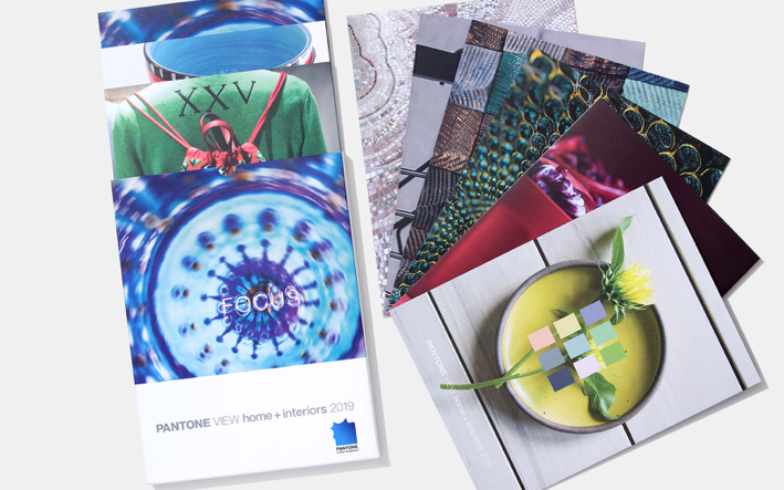
Pantone recently released their trend forecast for 2019 home décor including 8 color themes they predict will engage the imagination and appeal to the consumer’s buying inclinations for next year. We have curated selections of prints from our collection that fit perfectly into these color schemes, all available in a range of sizes and substrates to suit a variety of projects from residential to corporate and hospitality.
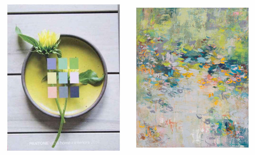
Above left image: Pantone Musings / Right image: Amy Donaldson "Inner Hope"
Musings: Quietly reflective yet vital shades of green, warm rose, pale lilac, and gray that convey a relaxed, healthy lifestyle. Shop the Pantone 2019 Musings collection.
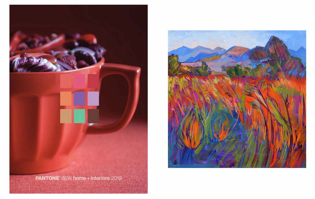
Above left image: Pantone Cravings / Right image: Erin Hanson "Scarlet Grass in Triptych (right)"
Cravings: Shades inspired by fetish foods that entice the eye and ignite the senses including grassy greens, red and purple. Shop the Pantone 2019 Cravings collection.
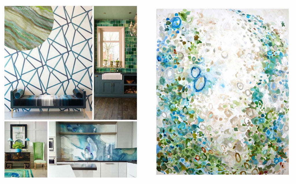
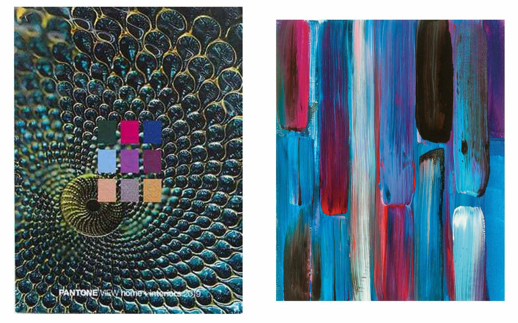
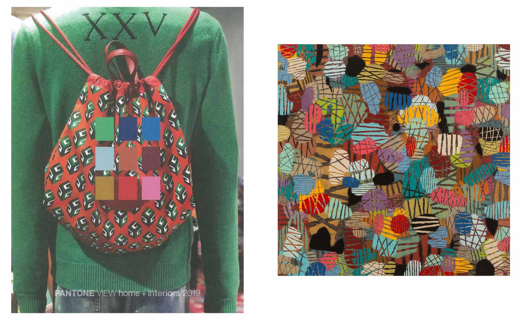
Above left image: Pantone Proximity / Right image: Casey Matthews "Swag"
Proximity: Colors that form a hybrid of technology and nature drawn from the complexities of 21stcentury life including tropical green-blues and blue-greens that blend into royal blues and crisp greens. Shop the Pantone 2019 Proximity collection.
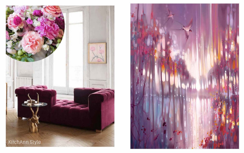
Above left image: Pantone Cherish / Right image: Gill Bustamante "A Beautiful Truth"
Cherish: Hues rooted in memories of comfort, affection, and contentment, with rose, mauve, opal, gray, frosted almond, fuchsia and grounded green. This palette forms a quiet, conflict-free refuge for the senses. Shop the Pantone 2019 Cherish collection.
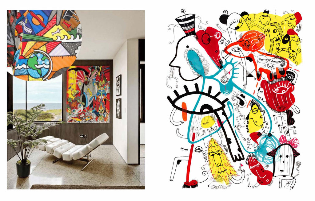 Above left image: Pantone Syncopated / Right image: Joi Murugavell "These streets have too many names"
Syncopated: A rhythmic, toe-tapping palette full of energy and exhilaration with shades of bright white, glowing yellow, and hot yellow-red, turquoise, and black. Shop the Pantone 2019 Syncopated collection.
Above left image: Pantone Paradoxical / Right image: Joan Davis "Treasure's First Colors No. 9"
Paradoxical: Both luxurious and accessible, this synthetic color scheme is full of unconventional pairings like placid blue, pink peacock, and dark green, with an eclectic mix of high and low and traditional and modern. Shop the Pantone 2019 Paradoxical collection.
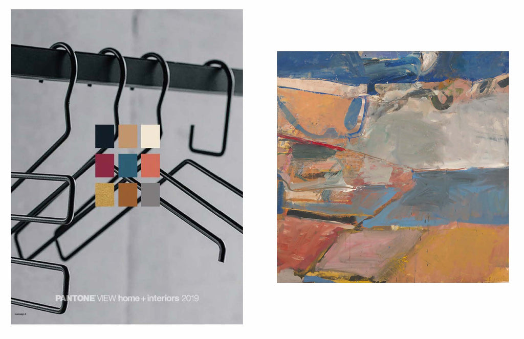
Above left image: Pantone Classico / Right image: Richard Diebenkorn "Berkeley #22, 1954"
Classico: An elegant palette with a nod to style fundamentals including swan white, camel, deep teal, gray flannels, burgundy reds, and caviar blacks. Shop the Pantone 2019 Classico collection.
Above left image: Pantone Meanderings / Right image: Downs "Mod Manhattan #1"
Meanderings: Full of unexpected treasures and pleasures, this palette is rooted in world travel (real or imagined) including world textures, ethnic products, spice tones, red, and wood materials. Shop the Pantone 2019 Meanderings collection.